Customize JfreeBarChart
A bar chart or bar graph is a chart
with rectangular bars with lengths proportional to the values that
they represent.We need charts to represent data in pictorial format
so that it becomes more appealing.
We have chart options present palette
but they have very limited customization properties available
therefore we need customizer classes to represent graph in a better
format.
In this article I will show how to
customize chart both by using customization properties in ireport
and through customizer classes.
Now how to create charts:
1.) Drag chart from palette window
into detail band or summary band depending upon requirements.
(I have used chart in
summary band).

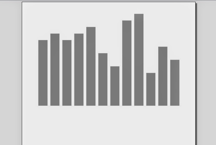
 |
| Default View BarChart |
 |
| Customize Bar Chart |
6.)View Of BarChart.
 |
| Customized Bar Chart |
7.) Now I fill Show how to
further customize bar chart remove X-axis and Y-axis grid lines.
In order to further customize
bar chart we will create a java project(I have created Project
named CustomizedCharts).
 |
| Jar files required |
9.)This is the customized chart code to remove X and Y horizontal and vertical gridlines.
 |
| Customizer Classes |

11.)Now Add
customizer bar chart by selecting customizer class option.

12.)After implementing
cutomization class the bar chart looks like.
13.) Now we will make customized bar
renderer class to show maximum length bar with green color and
minimum bar chart with blue color.We will add following code in
BarChart Class shown
in 9th point.
//Set the Customized
Bar Renderer
CustomizedCharts renderer = new
CustomizedCharts();
chart.getCategoryPlot().setRenderer((CategoryItemRenderer) renderer);
14.)Following is CustomizedCharts Class
code that implements BarRenderer

15.)View of cutomized chart
showing maximum with green and minimum with red color.

Hope this article would be helpful.
Please put your views or questions or suggestions below, I will be more than happy to hear them..
No comments:
Post a Comment